Megan Schlebecker

B.A. Psychology and English
Data Analysis and Data Visualization
View My LinkedIn Profile
California Wildfires 2013-2019: Patterns among the data
Project description: As the effects of climate change become ever present in our world, environmental destruction is starting to become more of a commonality rather than a rarity. One such effect of climate change is the increase in wildfires, as seen within the state of California. The purpose of this project was to use statistical analysis and data visualization tools to find trends among this dataset that could be helpful for prevention of wildfires as well as any points for future analysis. In addition, this page will document the progress through analysis and visualization for this project, including SQL queries, statistical analysis using R, and visualization using Tableau.
The dataset used was taken from a public access data set on Kaggle titled California Wildfires 2013-2020, the data in this dataset was originally sourced from CalFire, the website of the California Department of Forestry and Fire Protection. The data included information on the location (longitude, latitude, and county name) of the fire, the amount of acres burned, the name of the fire, the administration resources used to contain the fire like number of dozers, the fatalities and injuries from the fire, and the start and entinguish time of the fire among various other variables recorded. ___
1. Data Validation and Cleaning
After sourcing the data (as mentioned above), the data was uploaded to Google Sheets for validation and cleaning purposes and titled Wildfire Data Set. In order to prevent disrupting the original data, a copy of the original data was made for safe keeping and validation. After, a cleaning log was created to document the steps taken for cleaning.
Some cleaning steps taken include removing duplicate entries using the UniqueId column, which gave a unique ID to each fire, thus none of them should have been duplicated. Additionally, removing an unnecessary columns and information that was unneeded for this analysis, for instance the ControlStatement and ConditionStatement columns. Since analysis would be taking place using time elements, attention was given to format all dates correctly and to create a duration column to calculate the amount of days taken to extinguish the fire. However, when calculating duration, some errors in the EntinguishTime column where noted, including some extinguish dates measuring all the way back in 1963 and 470 incidents all recorded with the same extinguish date of 1-9-2018, it was decided to remove the extinguish dates from these entries and leave then null instead.
Please see cleaning log for more detailed steps taken for data cleaning.
2. SQL Analysis using BigQuery
Next, some basic SQL analyses were preformed to get a better understanding of the general trends among the data. The BigQuery SQL server was used to preform these analyses. Below are some examples of these SQL queries along with their results.
- Total Acres Burned per Year over 2013-2019
SELECT
  ArchiveYear as Year,
  SUM(AcresBurned) as Total_Acres_Burned
FROM `wildfires-1878-2019.California_Wildfires.wildfires`
GROUP BY ArchiveYear
ORDER BY ArchiveYear ASC
Results pulled:
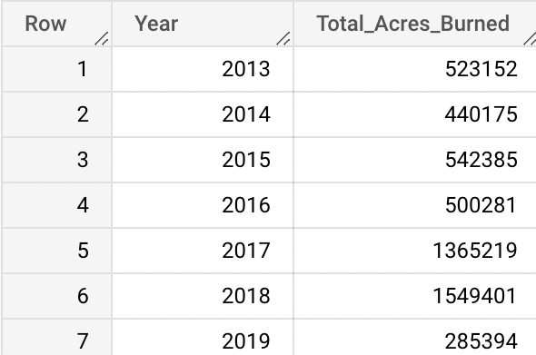
From this query, we can see already that years 2017 and 2018 had a significant increase in acreage burned per year, which brought up considerations as to why these years were so different. In order to understand more, another query was completed in order to understand if there was also an increase in total fires in these years, as well.
- Total Wildfires per Year
SELECT
  ArchiveYear as Year,
  COUNT(AcresBurned) as Number_of_Fires
FROM `wildfires-1878-2019.California_Wildfires.wildfires`
GROUP BY Year
ORDER BY Year ASC
Results pulled:
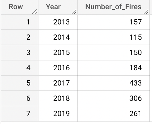
As predicted, there was a similar pattern with the amount of acres burned per year as the number of wildfires per year also increased in the years 2017 and 2018. However, 2019, did have an increased number of wildfires in comparison to other years, but had a relatively low number of acres burned. Due to the previous years’ destruction, it could be hypothesized that more money and resources were given to response efforts in order to minize damage, as well as more experience contributing to faster extinguishment of the fires.
In order to verify this hypothesize, more information would need to be gathered pertaining specifically to the amount of financial resources given to response efforts. This could be a point for further analysis.
Following, deeper analysis was focused on the county level to see if these general trends also appeared within the counties. The next SQL query was preformed to see which counties had the most fires overall compared to acreage burned.
- Counties with the Most Fires over 2013-2019 Compared to Their Acreage Burned
SELECT
  Counties as Counties,
  Count(AcresBurned) as Total_Fire_Incidents
FROM `wildfires-1878-2019.California_Wildfires.wildfires`
GROUP BY Counties
ORDER BY Total_Fire_Incidents DESC LIMIT 10
Results pulled:
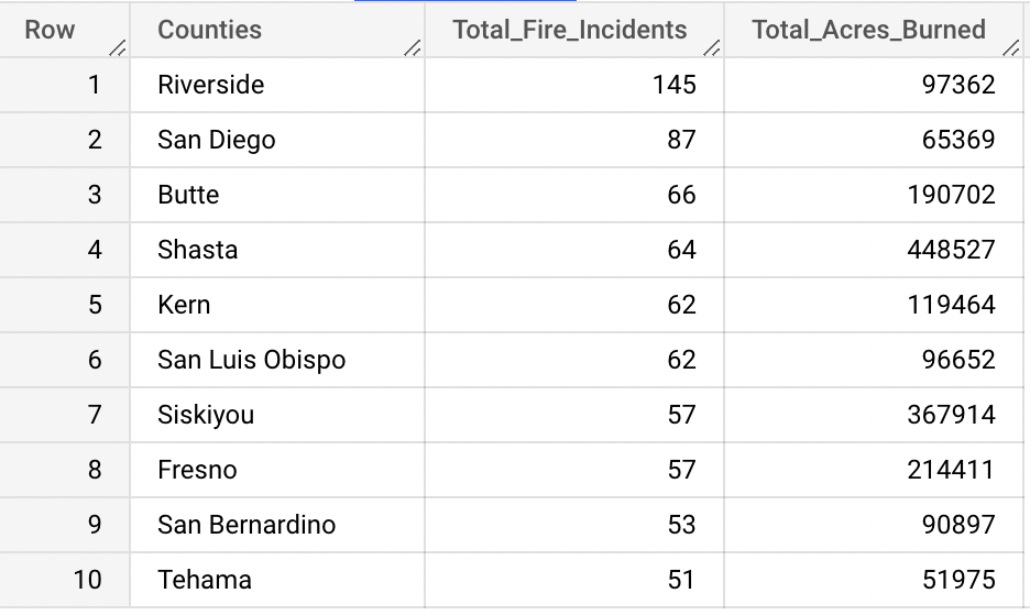
Interestingly, the results indicate that although these counties had an increased number of fires, they were not consistent in being high in acreage burned. Thus, counties may be high in number of fires or acreage burned without needing to be high in both, indicating some potential points for further analysis as to why this may be happening. It could be simplpy some counties are more likely to have higher chances of fires due to higher rates of drought and increased temperatures, but may not have the forestry compared to other counties to set massive blazes. On the other hand, some counties may be full of forests but have less chance of fires due to decreased temperatures and less human population causing wildfires. More analysis into the root cause of the fires could be useful to see why fires are starting in each county in order to best prevent fires and prepare for potential extinguishment.
Next, focus was directed to the duration of the wildfires in order to see if there was any specific information that could be gained from trends on the amount of time fires are ablaze.
- Average Duration of Wildfires in Days per Year
SELECT
  ArchiveYear as Year,
  ROUND(AVG(DurationDays),2) as Duration_in_Days
FROM `wildfires-1878-2019.California_Wildfires.wildfires`
GROUP BY ArchiveYear
ORDER BY ArchiveYear ASC
Results pulled:
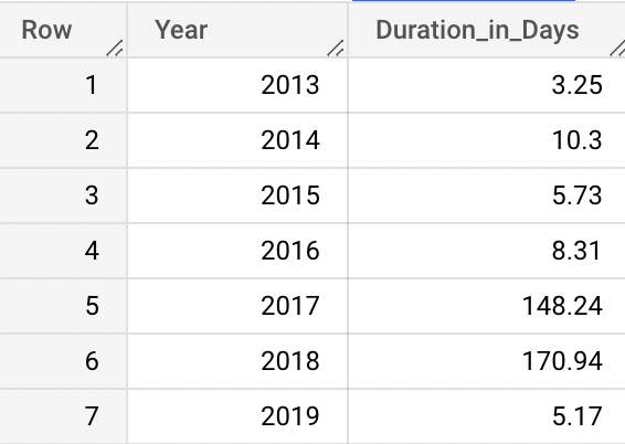
Here we see again that years 2017-2018 have a drastically different result than previous years, particularly that the fires were abalze for a significantly longer amount of time on average. Again this could be due to decreased resources, temperature differences, and drought.
A SQL query was developed to see which fires in particular where burning the longest along with the year they started and the number of acres that were burned by this fire.
- Fires with Above Average Duration Along with Acres Burned and Year of Fire
SELECT
  Name as Name,
  AcresBurned as Acres_Burned,
  ROUND(DurationDays,2) as Duration_in_Days,
  ArchiveYear as Year
FROM `wildfires-1878-2019.California_Wildfires.wildfires`
WHERE DurationDays>(Select AVG(DurationDays) from `wildfires-1878-2019.California_Wildfires.wildfires`)
ORDER BY Duration_in_Days DESC LIMIT 10
Results pulled:
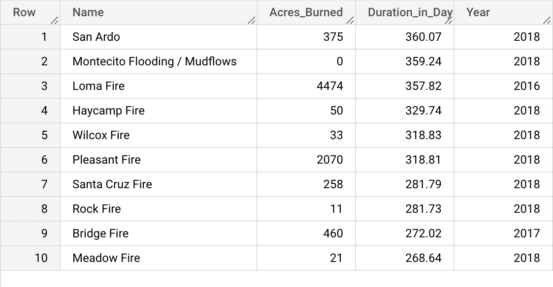
Within this table you can see that there was an overwhelming amount of these fires happening within in one year, 2018. To be specific, all but 2 of these fires. In addition, one of these fires that burned for almost a whole year, the Montecito Flooding/Mudflows fire burned a reported “0” acres. Much of these fires listed with the highest duration are much lower than the average wildfire of this list’s acreage burned being 3,241.60 acres. Which calls for further investigation into the validity of this dataset, in particular the measurement of time.
3. Using R for Further Statistical Analysis
Following, the dataset was uploaded into R Studio for continued statistical analysis and also basic visualization. A detailed R Markdown file can be found here.
After installing and loading essential packages into R Studio, including tidyverse, skimr, ggplot2, and reshape2 , some simple bar graphs were developed to visualize the data.
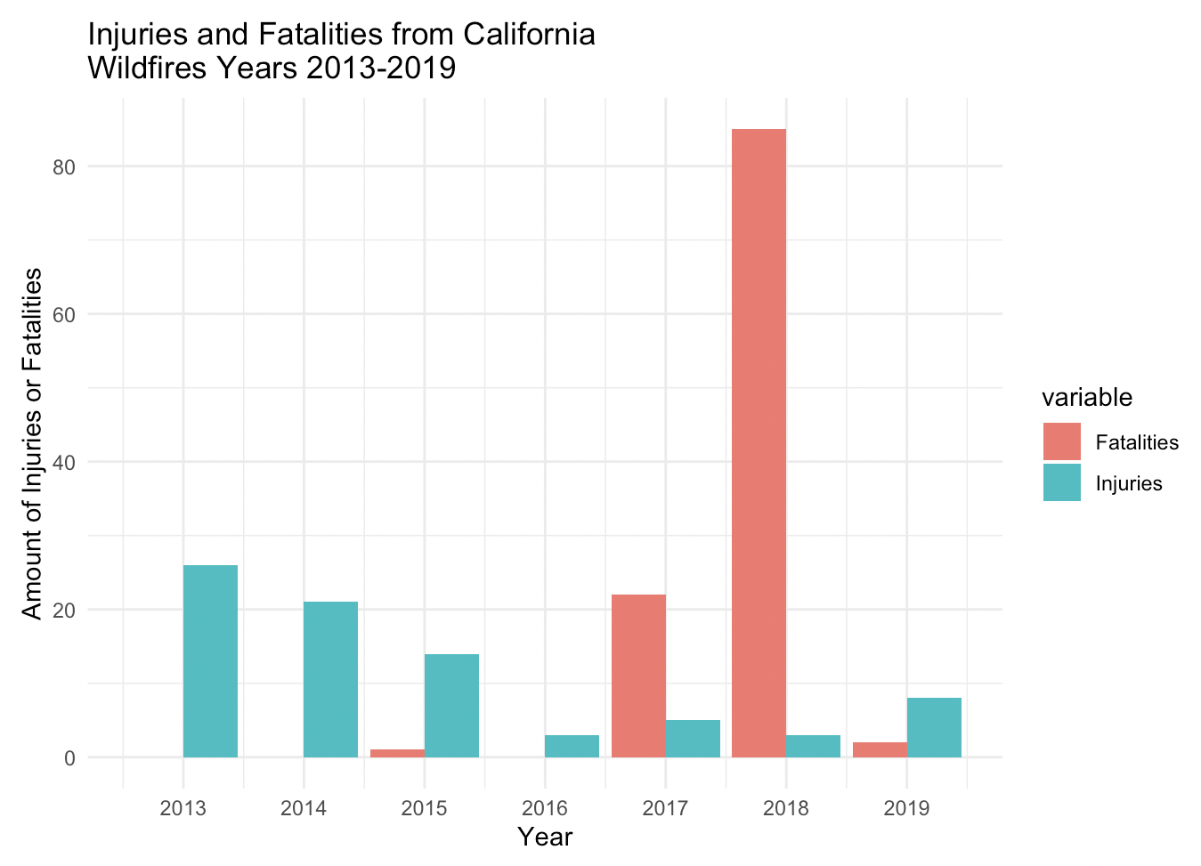
Below is an example of a graph developed using R that compares fatalities and injuries per year among all documented wildfires.
wildfire_df["Fatalities"][is.na(wildfire_df["Fatalities"])] <- 0
wildfire_df["Injuries"][is.na(wildfire_df["Injuries"])] <- 0

wdfm <- melt(wildfire_df[,c('ArchiveYear', 'Fatalities', 'Injuries')], id.vars=1)

ggplot(wdfm, aes(x=ArchiveYear, y= value)) +
  geom_bar(aes(fill = variable), stat = "identity", position = "dodge")+
  labs(title = "Injuries and Fatalities from California \nWildfires Years 2013-2019", x= "Year", y= "Amount of Injuries or Fatalities")+
  scale_x_continuous(name=waiver(), breaks= waiver(), n.breaks=7)
4. Advanced visualization using Tableau Public and Desktop Tableau
After, some detailed visualizations were created using the visualization platform of Tableau. For access to the live dashboard with highlighting features, please visit the dashboard on Tableau Public, found here.
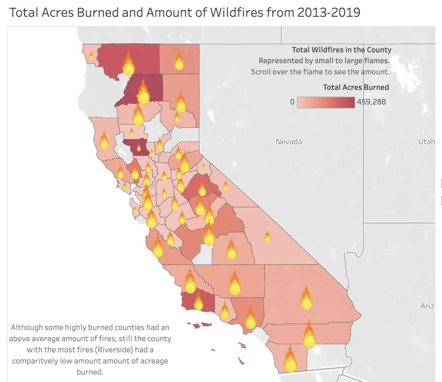
One interesting theme appearing among the data was the counties with the highest acreage burned were not the counties that had the most fires, as noted previously when completing SQL analysis. The following map graph displays this interesting phenonmenon, but is best experienced at the Tableau dashboard, below is only a screenshot.
As theorized before, the reason this discrepancy may exist could be due to environmental differences in forestry between the counties, increased draught in some counties, and the population differences between counties. However, it is still important to note and could be useful information to know in order to better prevent wildfires between the counties once analysis on the cause of these forest fires is completed. For instance, one county may benefit from better prevention education towards the general population on the effects of draught and increased temperatures leading to more instances of fires while another may benefit from an increased patrol of fire watchers spread out amongst the forest regions.
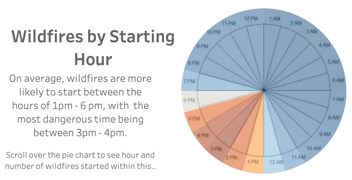
The graph below was created to demonstrate the most common starting times for all wildfires documented in this data set. Again this graph is best experienced in the Tableau dashboard where you can scroll over the graph to see it’s labels and features. Below is only a screenshot. The blue represents less wildfires starting within this hour while the dark orange indicates the most amount of wildfires starting in this hour and the white falls in between.
As you can see below, the most common start times are 3pm - 4pm. Thus, it could be helpful during this time period to have more wildfire prevention staff present during these hours, possibly overlapping shifts during this time. Again, understanding the root cause of these fires could be helpful in interpreting this information, as well. If there was more knowledge as to why these fires are happening at this time in particular, there could be better concentrated efforts to develop more effective prevention efforts.
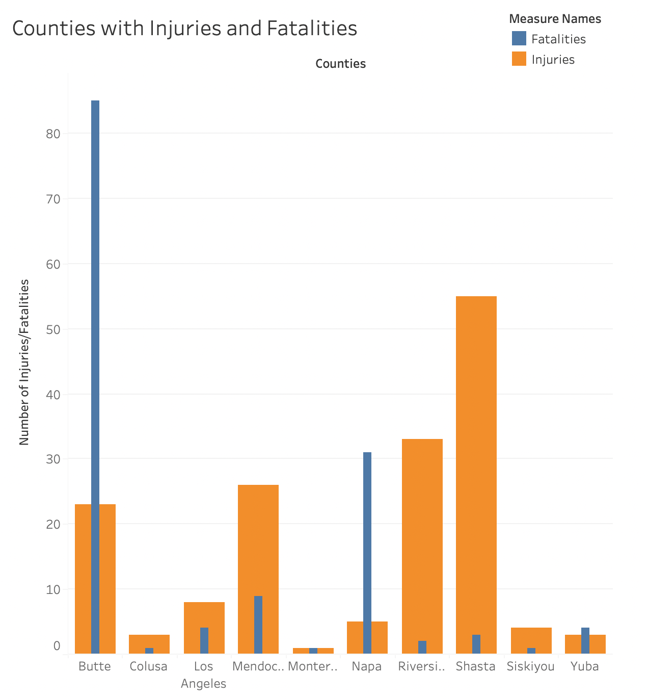
Lastly, the chart below was developed to show the counties that had injuries and fatalities, in order to understand which counties are plauged with the dedliest fires. This information could be used to look further into the steps taken by the public administration, including extinguishng teams, fire departments, and police efforts to see if there could be improvements compared to other counties, which could be a useful place for further analysis including response time and attempts to inform, warn, and evacuate the public. Of course, there are numerous factos as to why these counties experienced the highest number of injuries and fatalities, but furhter research could be useful to help prevent any further injuries or fatalities.
Conclusions and Take Aways
After completing this project, there were a few major points to be taken from this analysis.
Themes Among the Data and Possible Pointers for Prevention
- Years 2017 and 2018 were the highest for both acreage burned, amount of fires, average duration of fires, and fatalities; however, 2019 was lower than both previous years in all four catergories.
- The counties that were highest in acreage burned were not the same counties with the most number of wildfires, thus prevention efforts should look different on both ends.
- The most common start time of fires is afternoon, particulary 3pm - 4pm.
Points for Further Analysis
- An exploration into the cause of wildfires, particularly by county, could be helpful to understand the differences in size and duraiton of wildfires in different counties.
- A deep dive into understanding the reasoning as to why 2019 had such dramatic decreases in wildfires after 2017-2018 would be helpful for continued prevention efforts. What in particular changed in 2019 after two years that were so destrutful? Possible reasons could include financial resources and public education.